Aspect Ratio for architecture and interiors photography
Unless specified by the client I generally provide finished and sharpened image files output for use in two formats:
- jpegs for web at about 1200 pixels across
- jpegs or TIFFs for normal print at 4000 pixels (about A4 size)
I find that these formats are suitable for most clients as larger files can become cumbersome for them to handle.
Those clients that I know might want to produce images at a large scale or might want to crop dramatically are also supplied with unsharpened TIFFs at A1 size. These files can be enormous (nearly a quarter of a Gigabyte) so I am careful to make sure the client understands what to expect. In any case, clients can always come back to me to output files at a size they didn’t realise they need. All my past work is archived for future use.
But that is not the purpose of this article. I really want to say something about aspect ratios. That is the proportions of wodth and height of the image. In providing clients with images I do take a view about the destination. When I know that the files will be used by a professional designer who will want to create their own crop I always supply the whole image unless it really doesn’t work without being cropped.
For most clients, images are likely to be used for various purposes often by people working day to day in the business. In this case I provide creative cropping to show how the image my be used to best effect.
The native aspect of the sensors I use is 3:2 which looks like this:
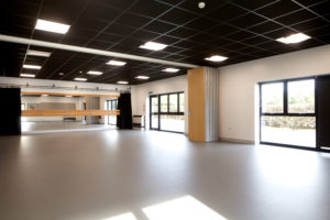
If I am cropping I use three different basic aspect ratios:
Square 1:1 – I only use this aspect ratio when the subject really demands it. It brings formality and symmetry to the image and is a format commonly used in fine art photography.
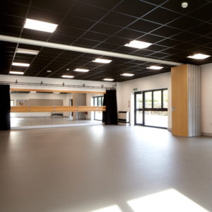
DL (approx 1:2) – Whilst the taller 16:9 is a more common panoramic ratio, I find that something closer to a DL envelope size works better on the web and in documents.
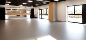
4:5 – this is a ratio that has commonly been used for photographing architecture. I use it when I can as it helps give status to images. I believe it evokes something for people accustomed to looking at architectural photography so I will often use if for images intended fro architectural publications. It also happens to be the same aspect as was used for the common 8 x 10 prints of old.
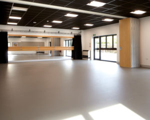
I always provide what my clients ask for but so often they are looking to me to take a lead in which case I do crop images to suggest to them the best ways that those images might be used.
A single image can be used in anything from PowerPoint presentations to glossy annual reports to exhibition display stands. To look its best, each use demands a particular output. I am keen to see my images displayed at their best so I am always pleased to advise and output images at the optimum size for that use. If you are already a client you will know that I am not the kind of photographer to make additional charges for this kind of thing.
